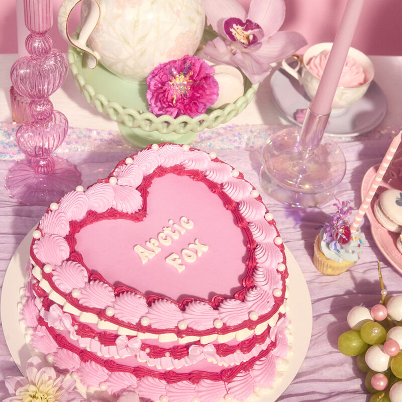
Arctic Fox Pastel Hour Collection

Arctic Fox Pastel Hour Collection
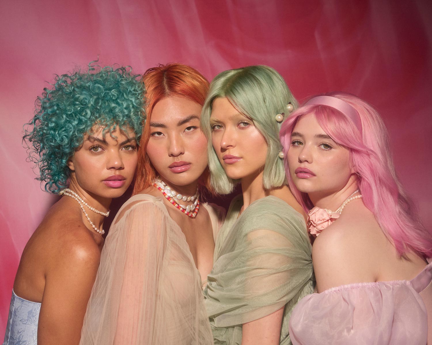
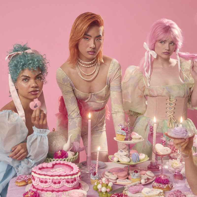
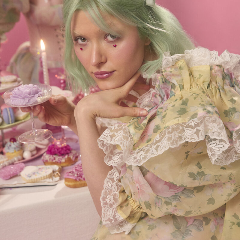
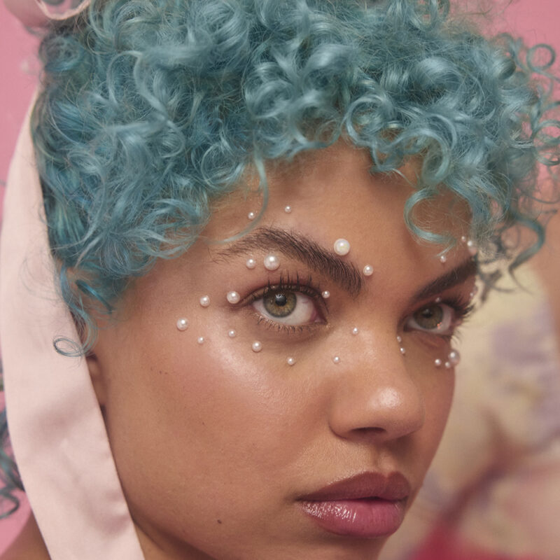
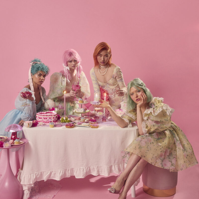
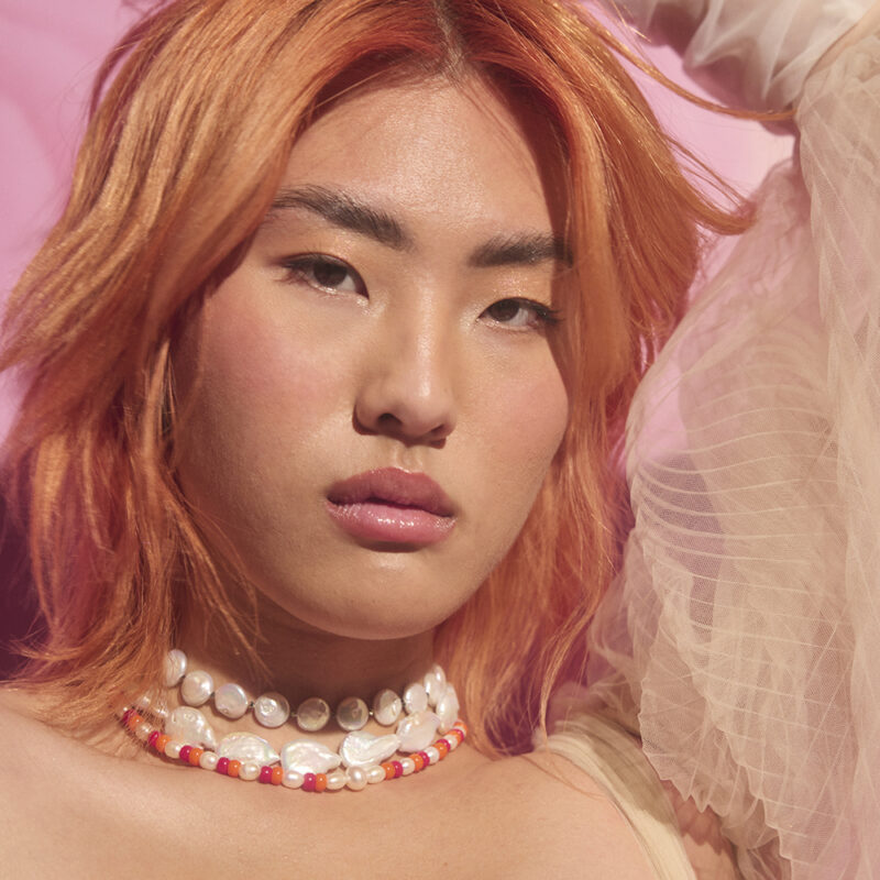
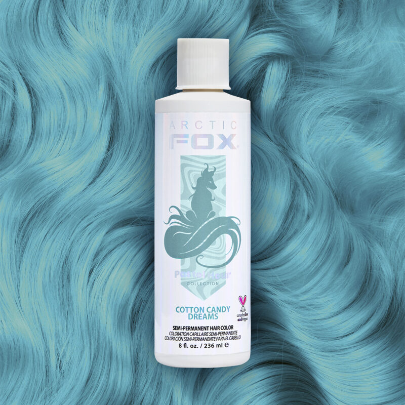
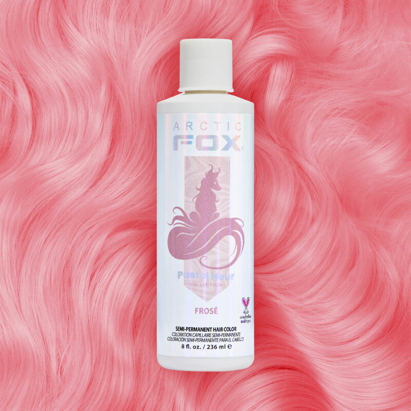
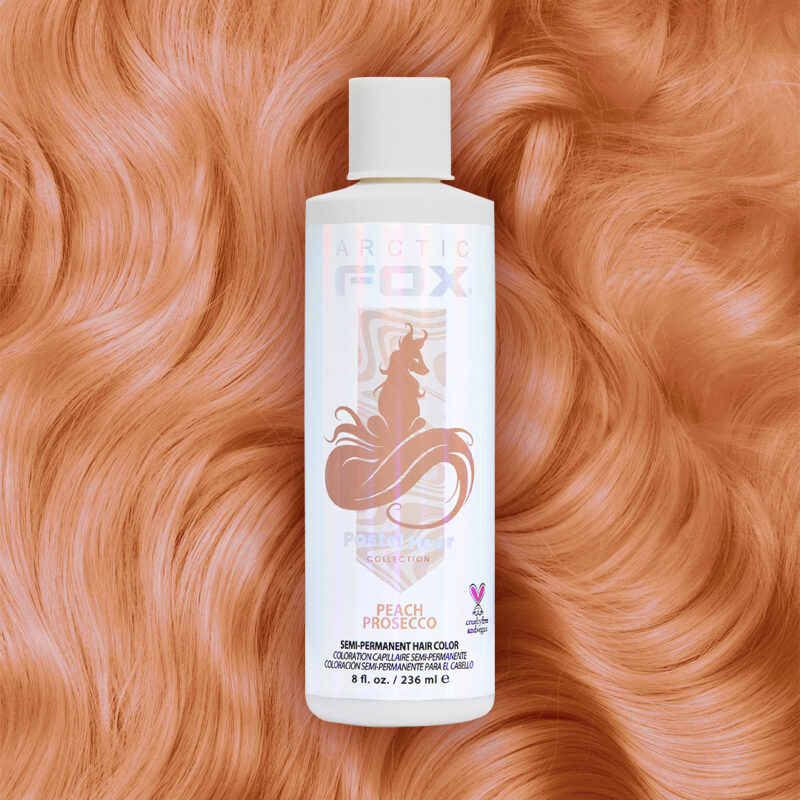
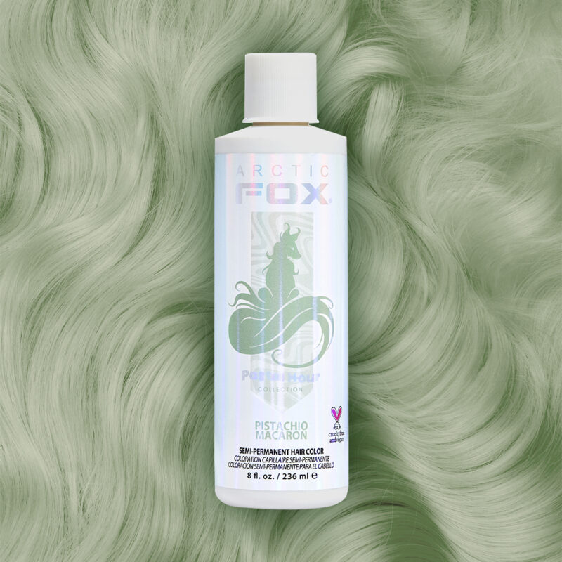
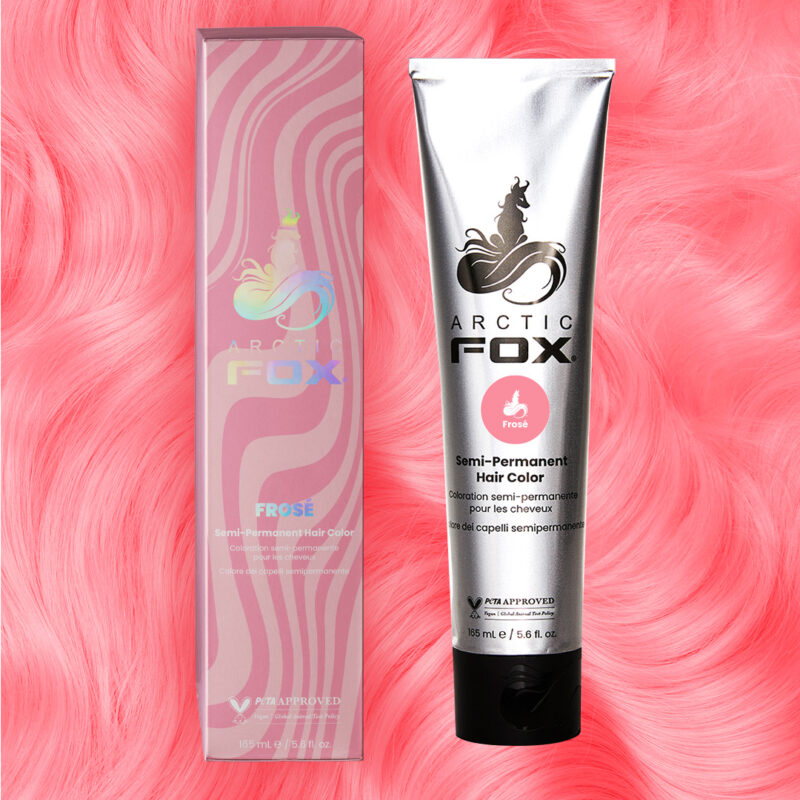
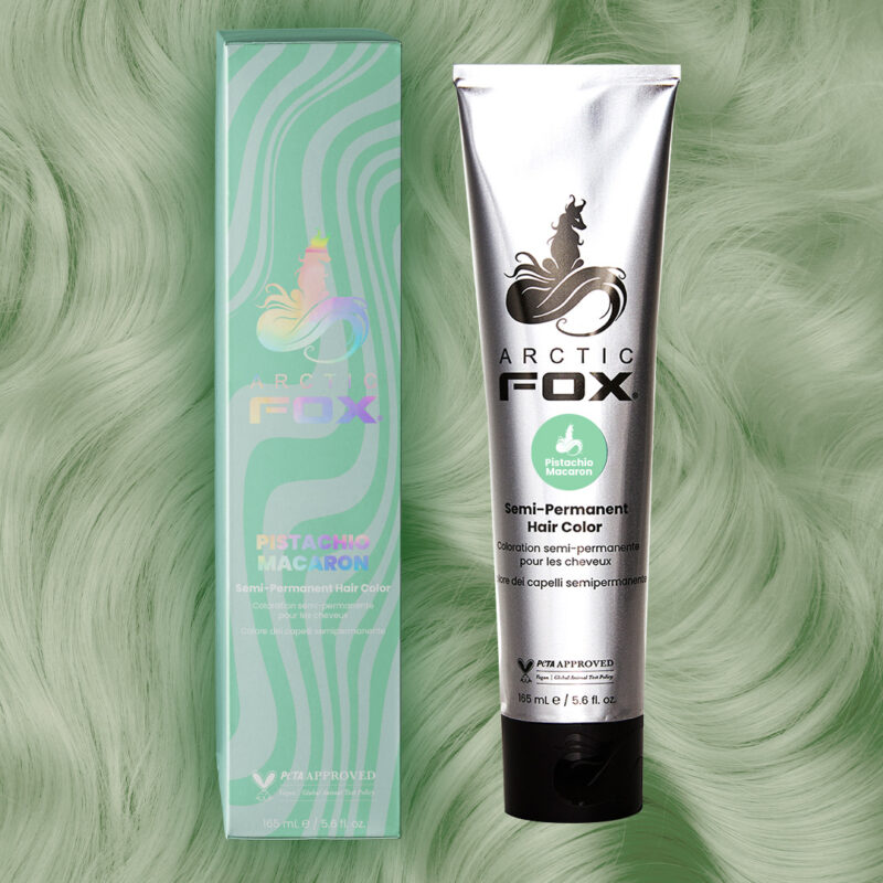
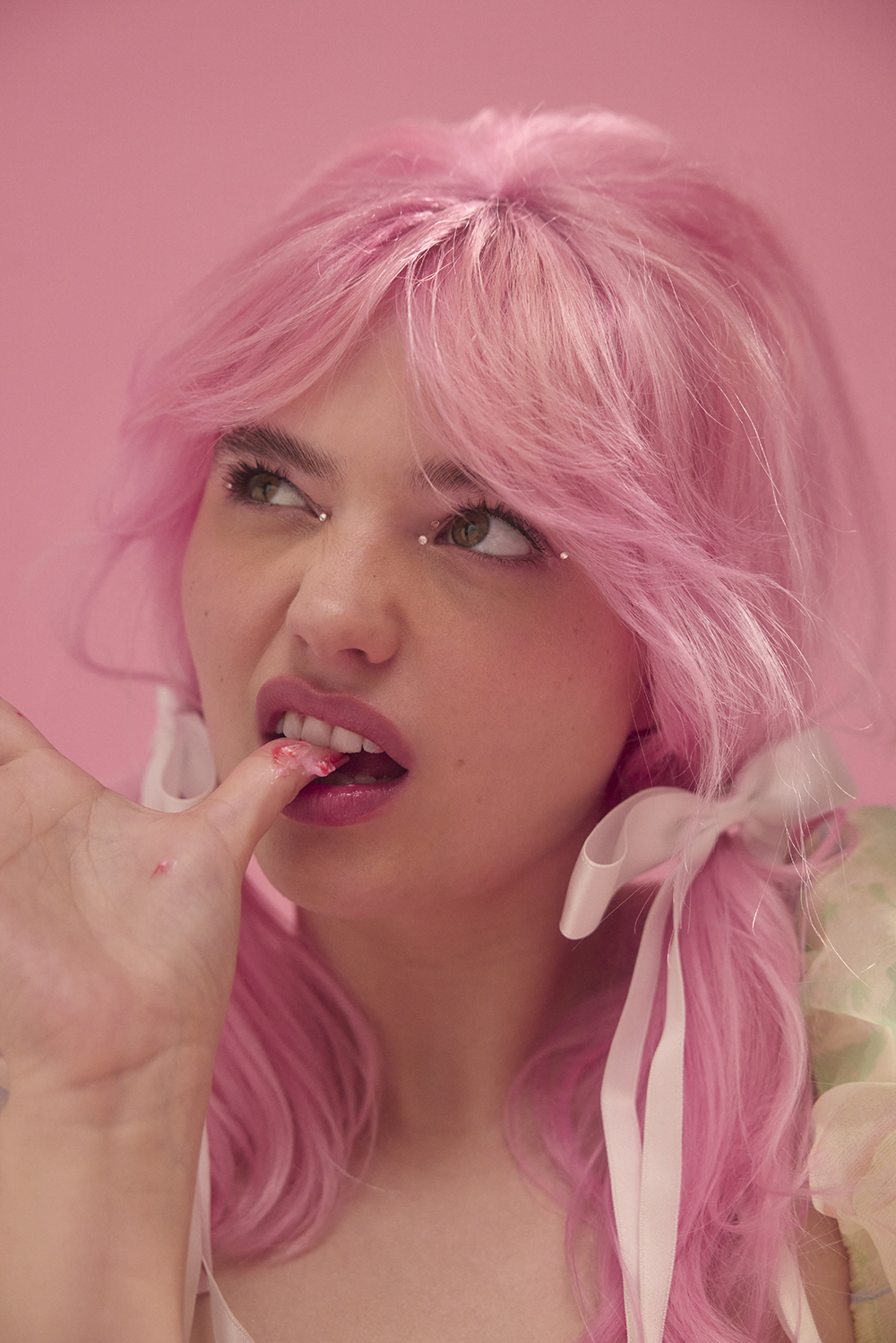
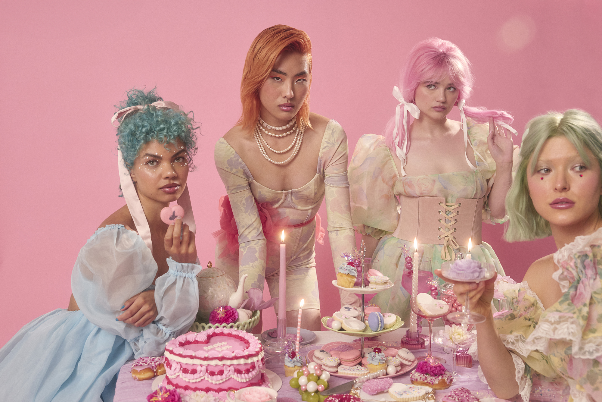
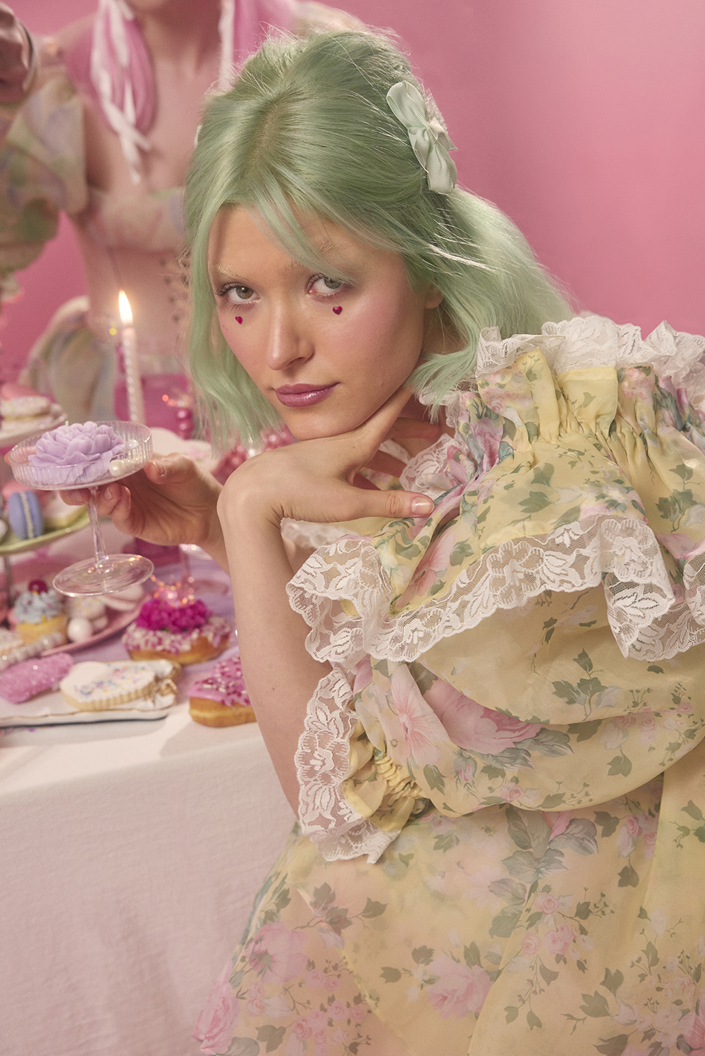
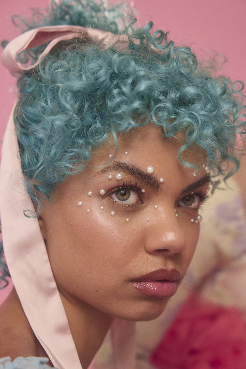
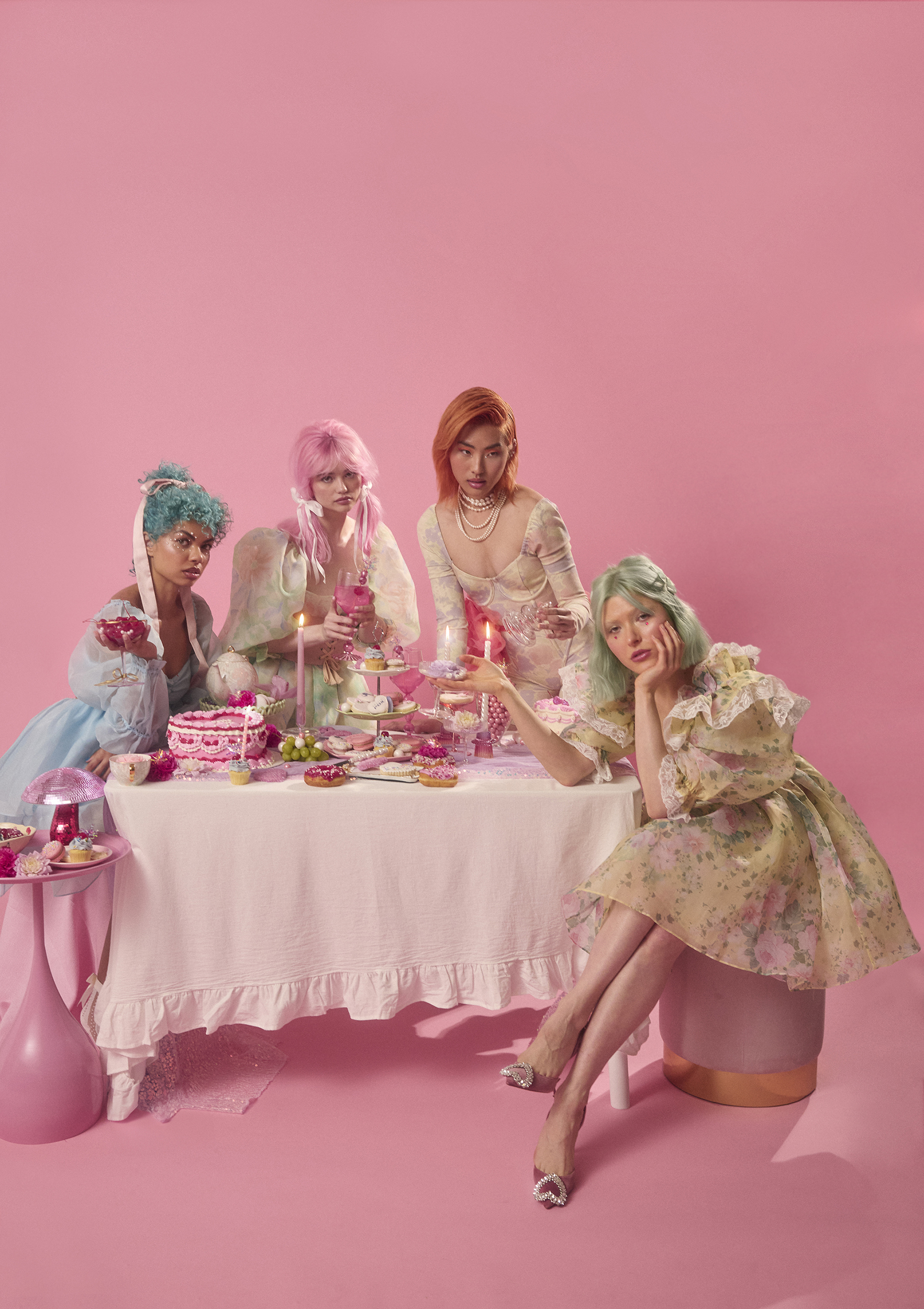
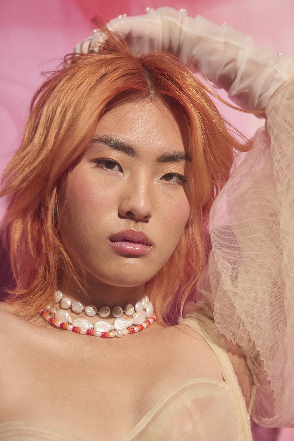
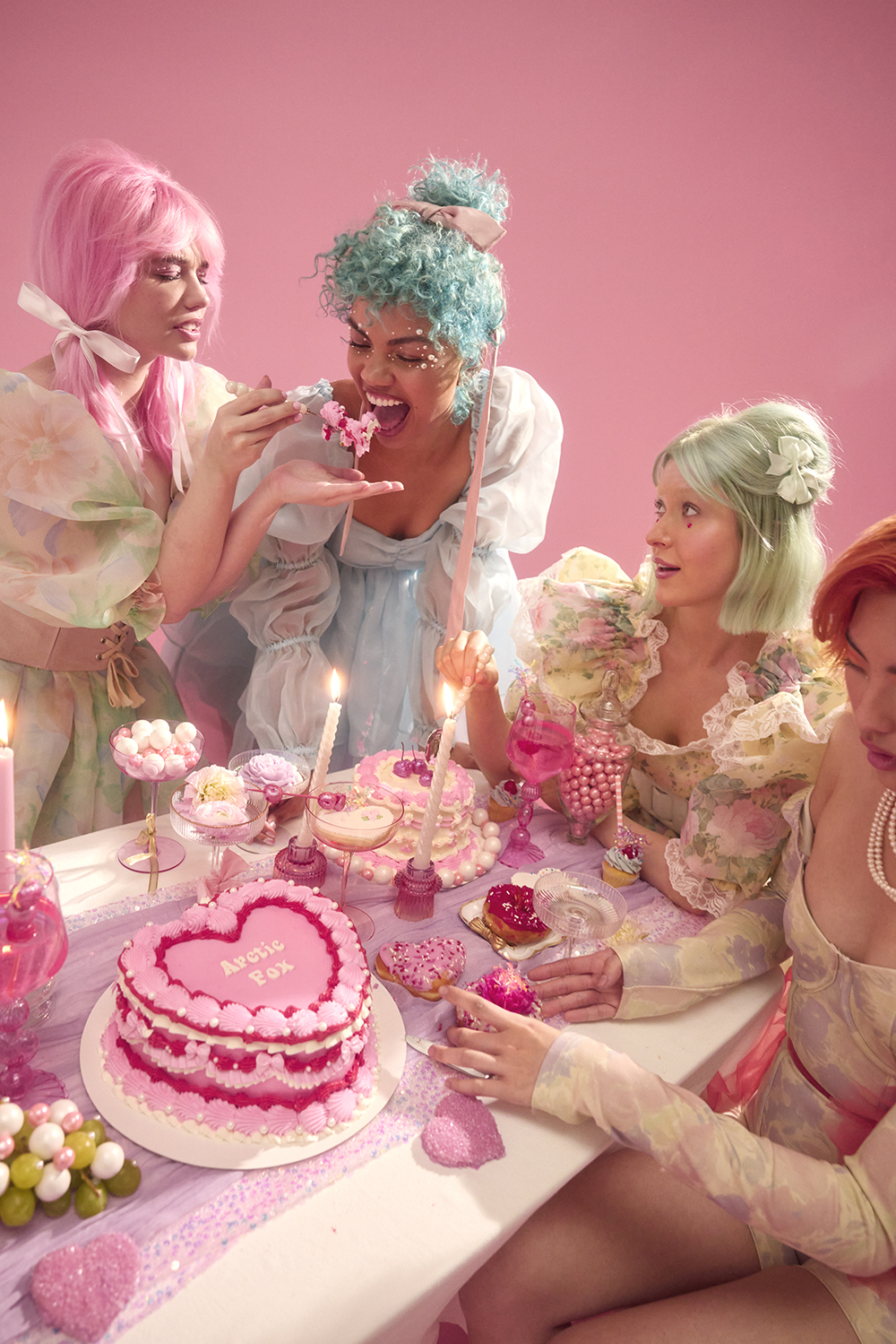
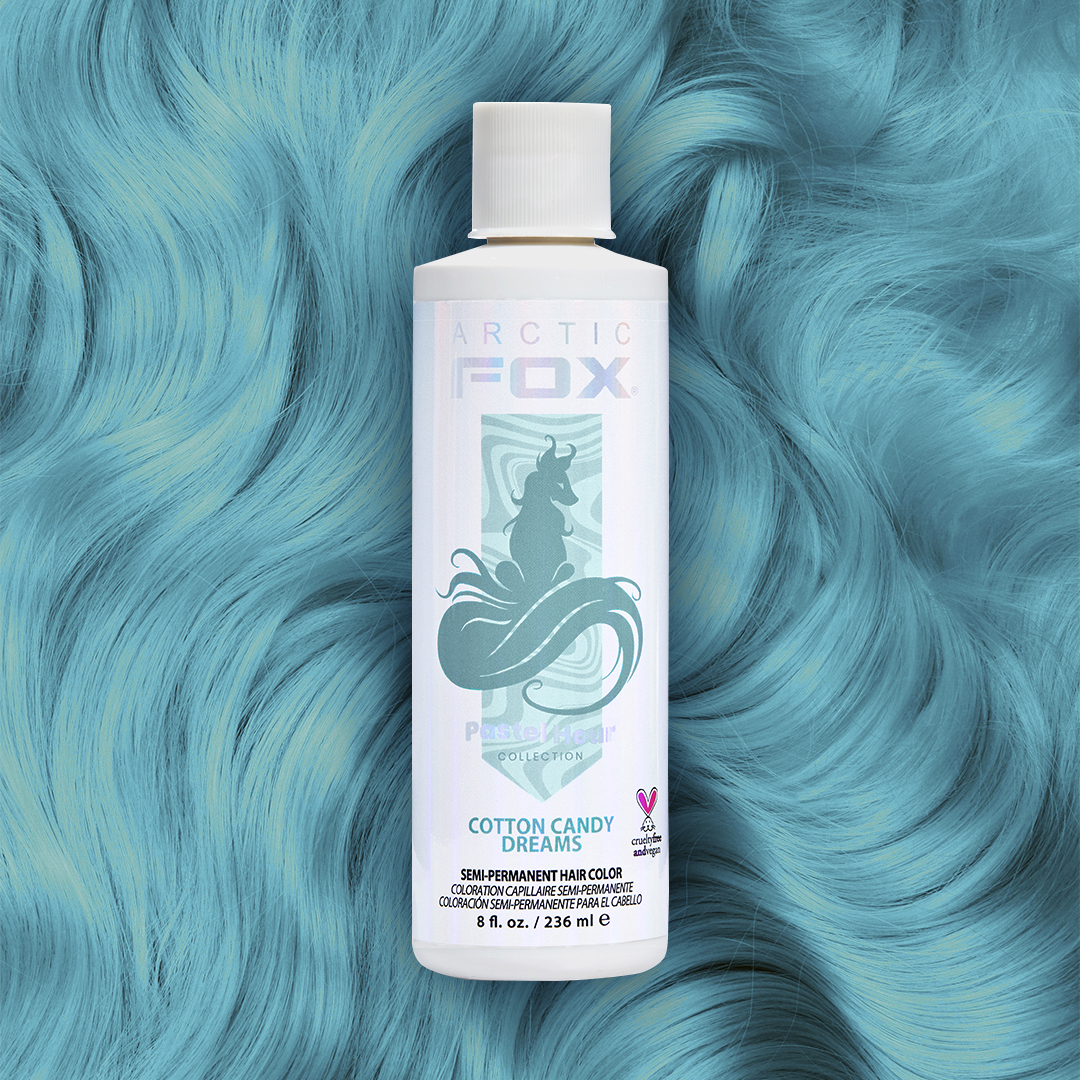
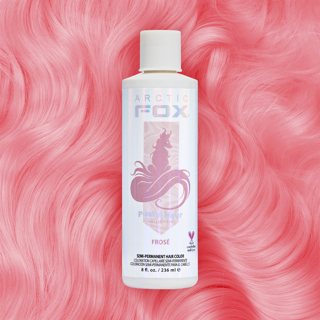
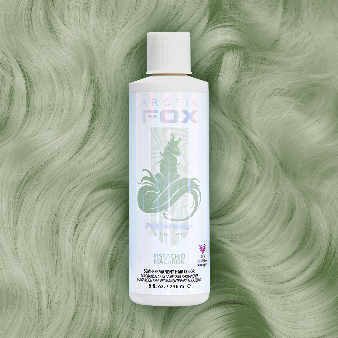
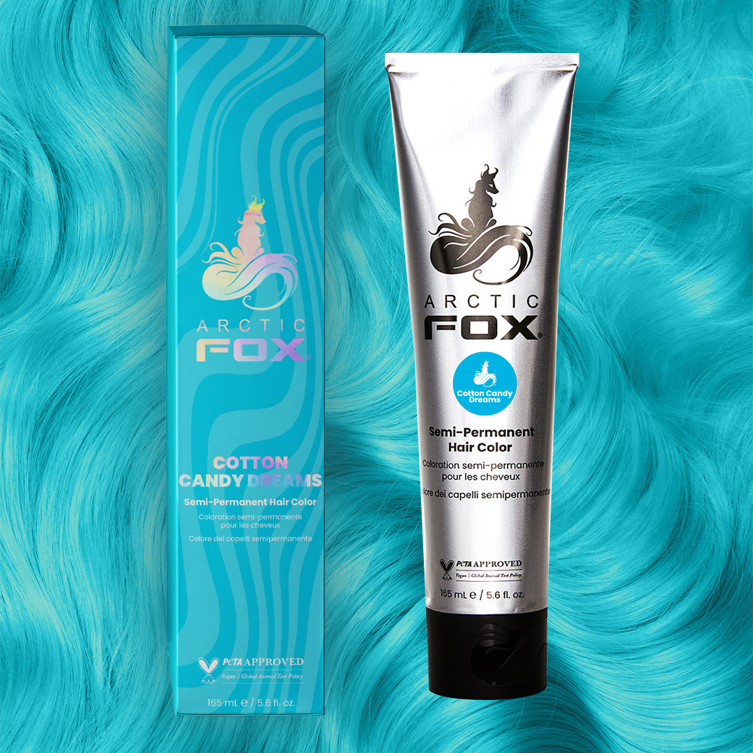
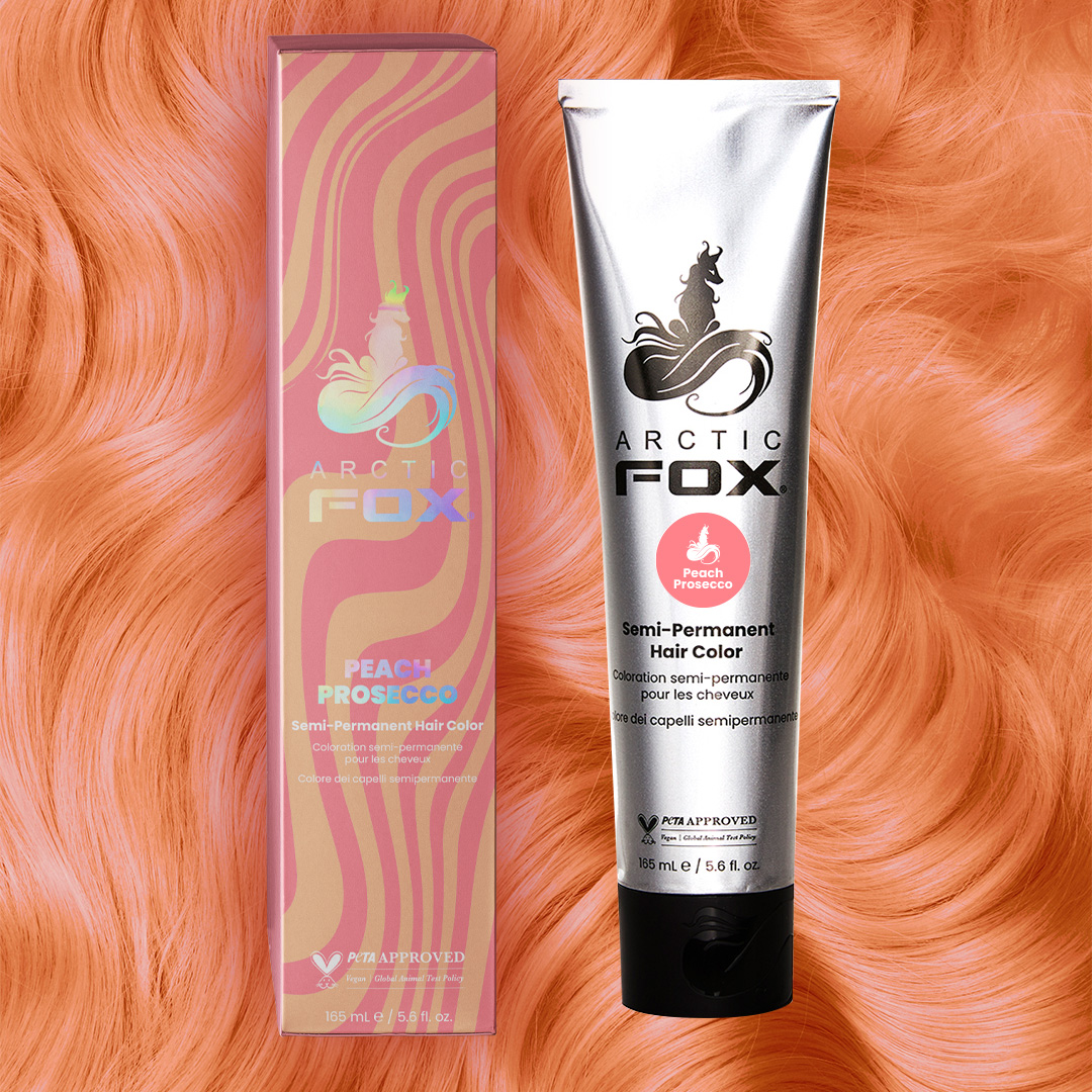
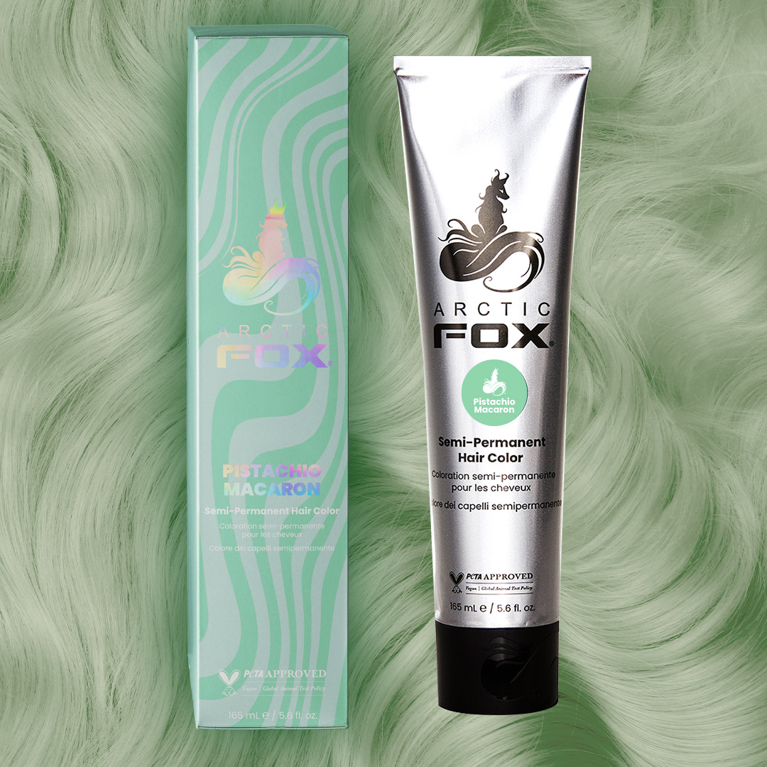
The brand new Arctic Fox collection consists of four pastel semi-permanent hair colors, three completely new shades and one you know and love. These sweet hues are an absolute dream to stare at and play with. Take a bite into Cotton Candy Dreams, a highly sought after light blue, the most coveted color this year peach in Peach Prosecco, the softest green in Pistachio Macaron, and our beloved baby pink in Frosé.
Creative Direction
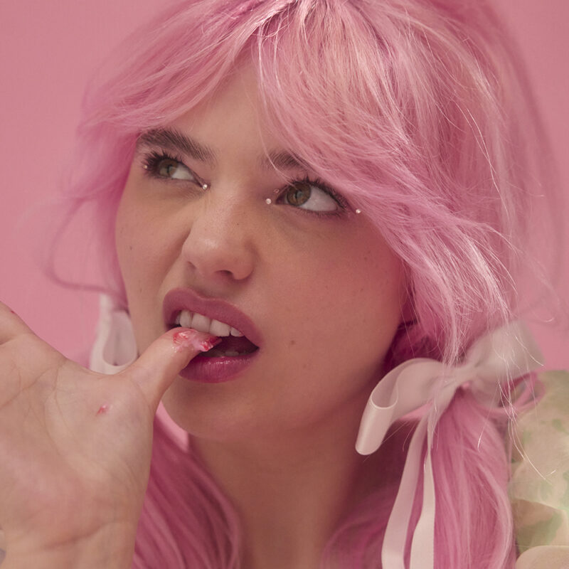
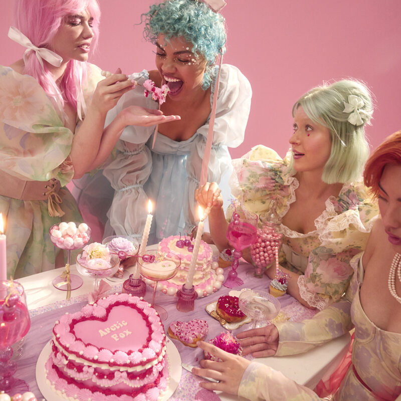
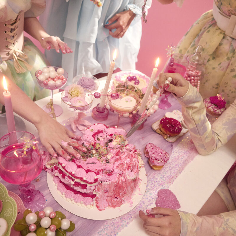
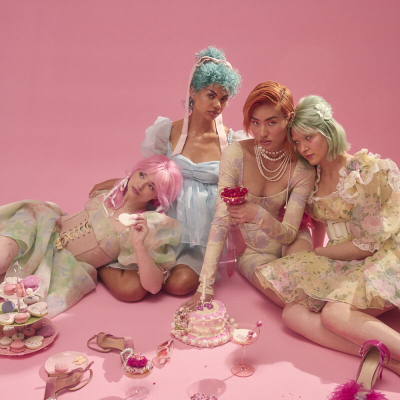
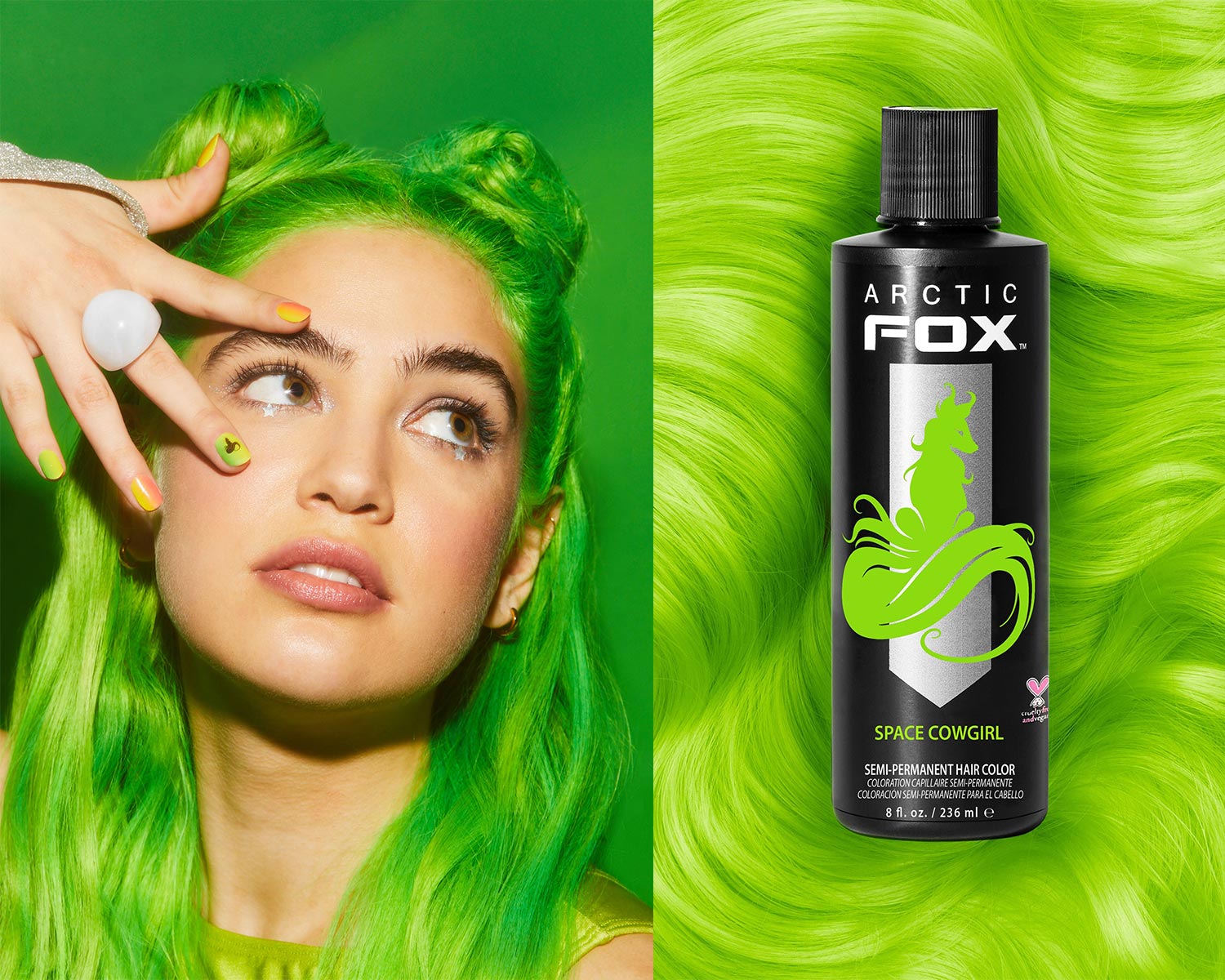
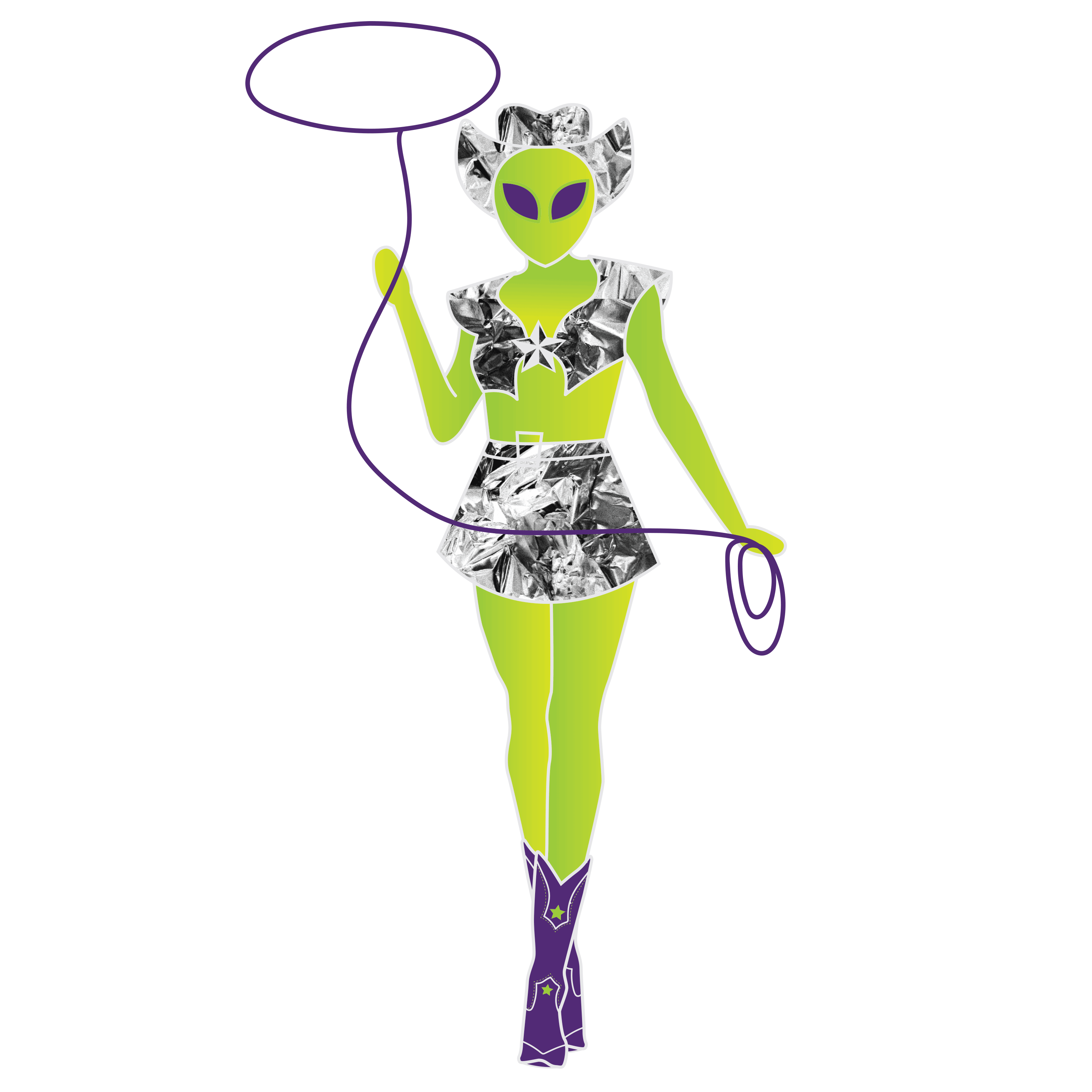
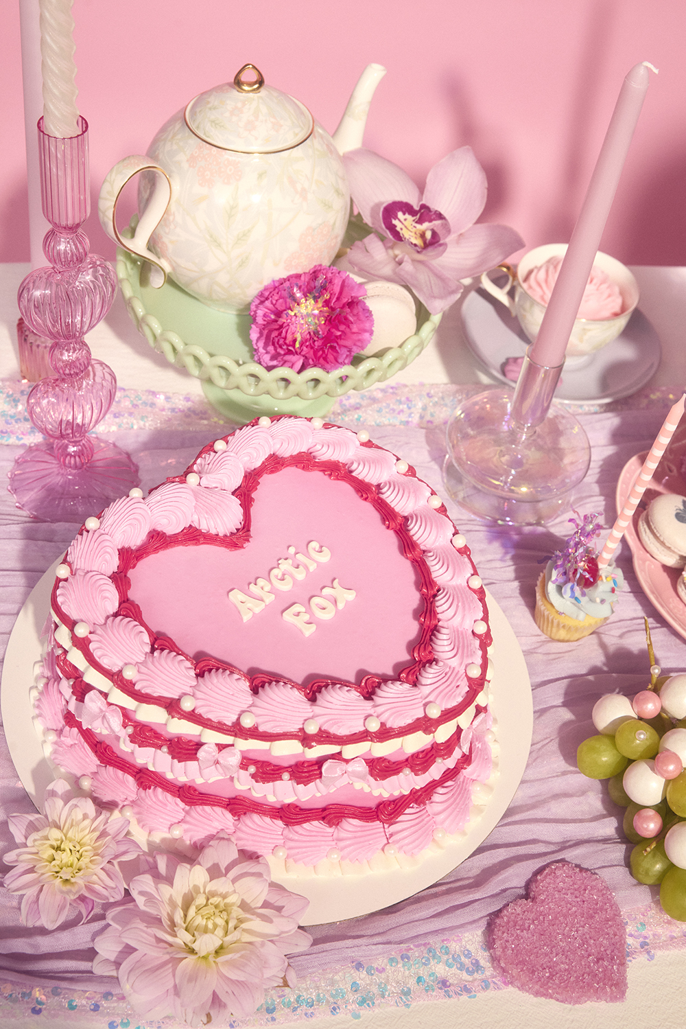
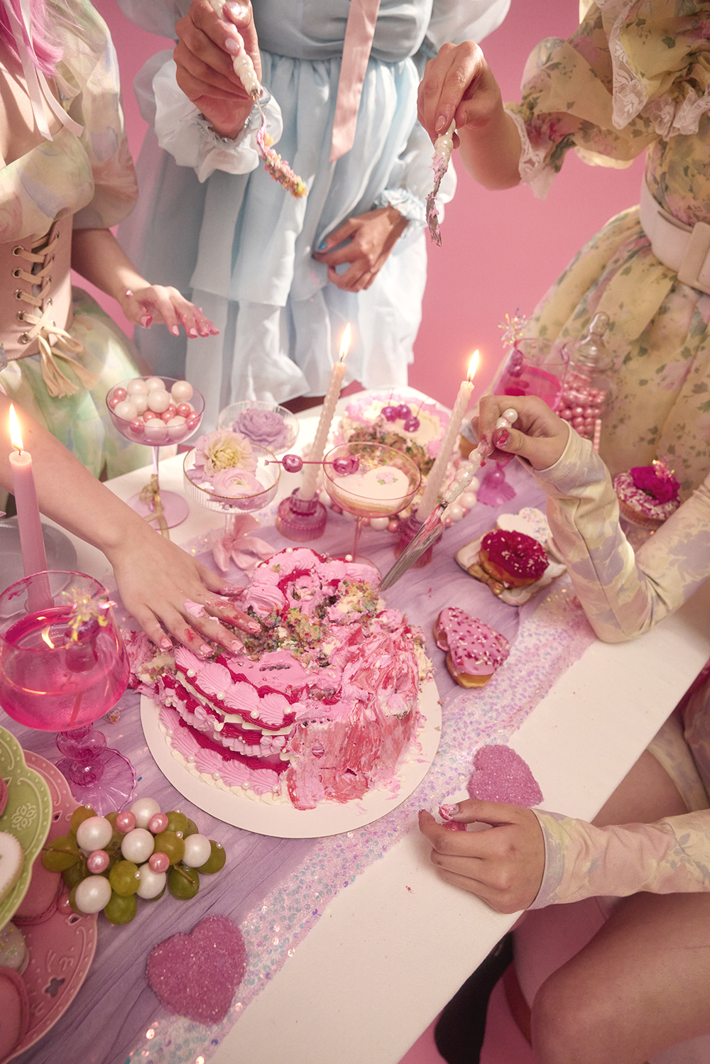
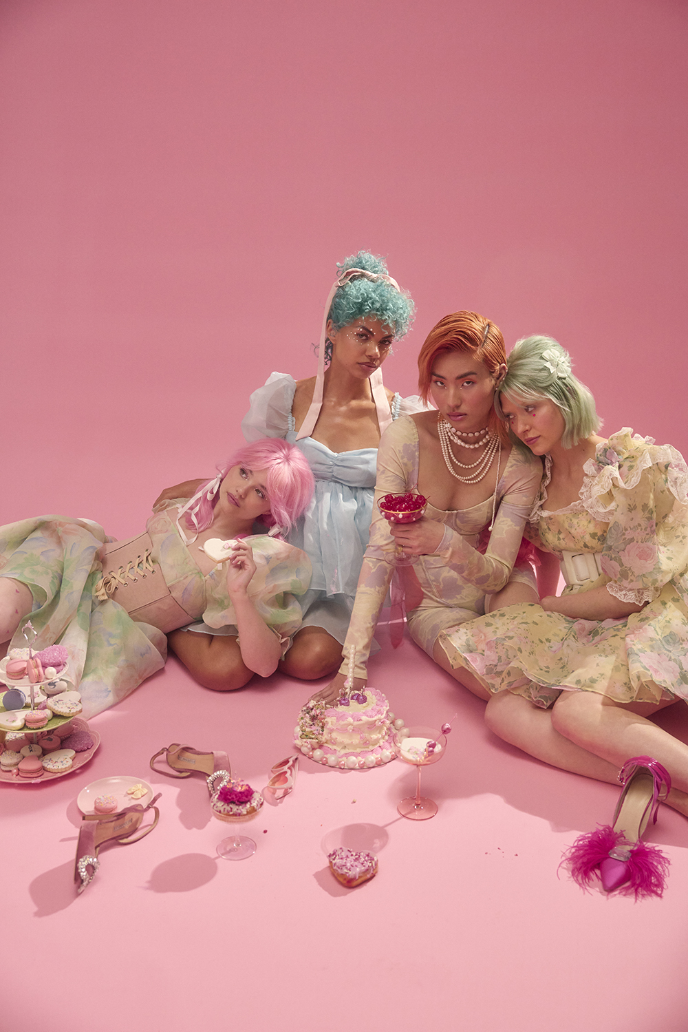
This campaign finds a balance between the Euphoria-type of party girl and the emerging coquette trend. She’s sweet on the outside and a little sour on the inside.

Packaging
For the US packaging, I took the current black bottle packaging and transformed it into a collection of bottles that would stand out, but also tie back to our current brand.
For the EU certified packaging, we used the same colorways as the US packaging and applied it to the new swirl box packaging.


Organic Social
Arctic Fox’s organic social channels are imperative to our campaign’s success. The campaign launch post outperformed the previous product launch campaign launch post by +300% in engagement.


Continuous Carousel Post


Paid Social
Mailer


PR Box Concept


